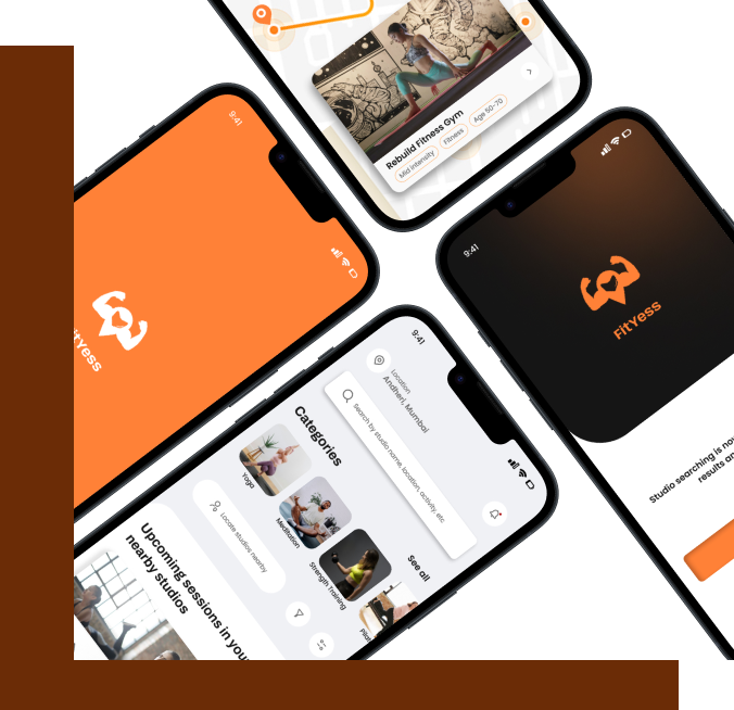
What if staying active and healthy could be as simple as a few taps on your phone, even for those who didn’t grow up with technology?
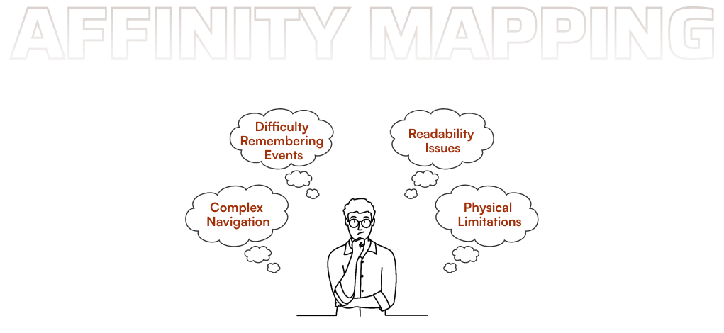
For many in India’s 50+ community, the experience of navigating complex fitness apps can be discouraging, often making it difficult to maintain an active lifestyle.
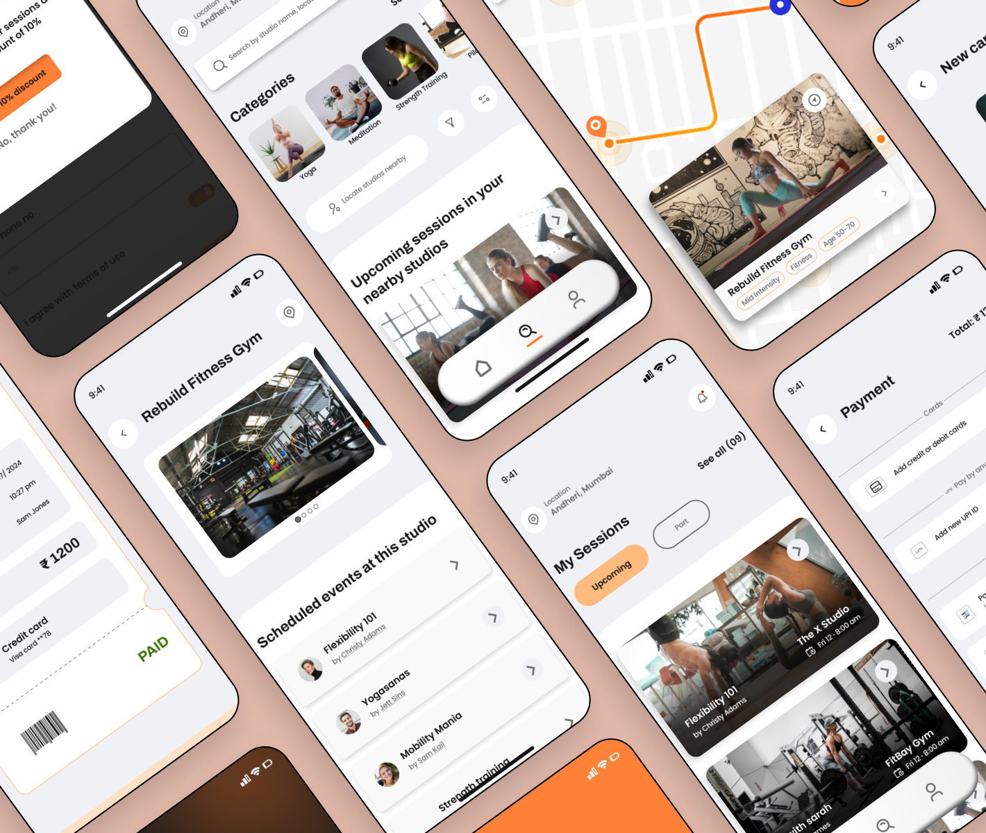
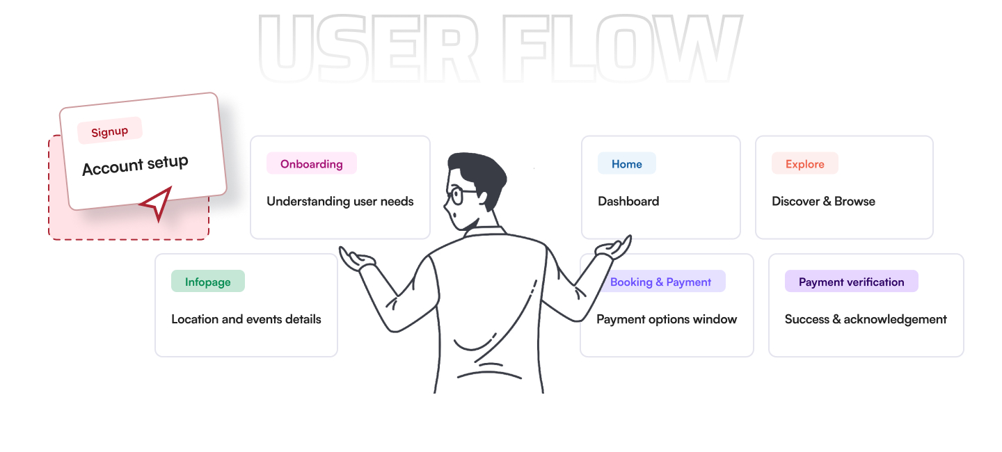
By focusing on intuitive design and accessibility, there’s an opportunity to bridge this gap and create a seamless experience that encourages wellness for all.